The kitchen project seems a little daunting to our DIY skills, so we hired the expert builders at Home Makers of Oregon to help us. Our contractor, Mary Tongue, is amazing and understands exactly what we are looking for… which is HUGE because our ideas are not the typical “Tuscan-villa, granite drenched” designs so typical in today’s kitchen remodel projects. We showed her our inspiration photos, discussed functionality, materials, and focused on how to blend modern appliances with our vintage finds. She brought in Kathy Fuller from Fuller Spaces to work up the final kitchen design, and we couldn’t be more thrilled with how she transferred our ideas into one unified design… she even worked in side-by-side double ovens into our small space. Yay!
This is the elevation layout from Fuller Spaces:
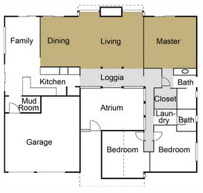
With this I was able to draw up a new floorplan and perspective elevation. We made a couple of measurement adjustments (those silly beams really get in the way), but the basic design is the same.
Note from Steve- Dig Haley’s mad Illustrator skillz! She’s working on a living color version of the perspective elevation… the plan is sliding frosted glass doors on top, birch doors on the bottom (I wanted those to be sliding, too… but I think this design works just fine), white countertops (Formica today, maybe solid surface white later), white-ish VCT on the floor (matches the loggia), and happy people milling about. We’re still not clear on what to do with the backsplash above the sink. Maybe mosiac tiles in mostly white with a random color here and there? hmmmm

Our new design includes unique features inspired by original Eichler/Rummer kitchen designs and Case Study #22’s kitchen. Overall, we are pleased that the design appears to be a nice blend of then and now without losing functionality. Here is a quick punch list of a few specific features we are excited about:
1. Vintage Thermador double ovens and cooktop with built in griddle. Thank you Craigslist!
2. Built in spice cabinet above the cooktop with sliding doors. A common feature in Eichler/Rummer kitchens.
3. Electrolux Icon counter depth side-by-side refrigerator (built-in look without the built-in cost)
4. Microwave stainless trim package tucked away at the end of cooktop cabinet (with drawer underneath for popcorn!)
5. Wall between dining room and kitchen removed with pass through bar
6. Raised lower cabinets (stainless legs)
7. Remove walk-in pantry to allow more counter space
8. Floor to ceiling pantry cabinets (next to refrigerator and office nook)
9. Sliding frosted glass doors on upper cabinets
10. Up-lighting and down-lighting on upper cabinets (hidden as much as possible)
11. Built-in kitchen center by TCC (very similar to NuTone food center)
12. VCT flooring
13. White laminate countertops
14. Birch cabinets
15. Vintage drawer pulls (or cool ones from Rejuvenation)
16. Built-in office nook (lots of storage)
17. …and ball lights, of course!
We haven’t said much about the family room, but in a nutshell it will have VCT tile that matches the kitchen, new trim, and a media cabinet of some kind (I’m thinking maybe an Eichler/Rummer “coffin” style cabinet mounted low on the wall, or something cool from Kerf or maybe IKEA).


Wait a second, no Tuscan villa? Don't you understand that the resale value of your home would go way up if you opted for stainless steel, italian tile, and granite counters? While you are at it, you could use beautiful handpainted tiles that depict chickens, and other country characters for a whimsical appeal. I hope you arent planning on selling soon…
If you are planning to install granite worktops in your kitchen, then you need to bring a sketch with very accurate dimensions or eliminate any risk by taking advantage of the dealer's professional measuring services.
Husband- We were hoping for granite with an etched lattice pattern. (JUST KIDDING!)
Tony- Thanks for the tip, but we're going for a more original feel with the countertops, either a white quartz or good old fashion Formica. In either case, you're totally right… super exact measurements are a MUST! Thanks.
Great work on the kitchen! Did you guys use Homemakers for the project or just the planning? My wife and I are gearing up to remodel our kitchen and are looking for a contractor who gets the style.
Hey Jeff,
We used them for the planning, and organized some of the sub-contractors, but we found it was really easier (and better) to hire the people ourselves. Turned out that we were the only ones who "got us!" 😉
Except our cabinet guy… he totally "got us" and was a real pleasure to work with!
Good luck in your project and drop me a line if you'd like to discuss anything in detail.
-Steve