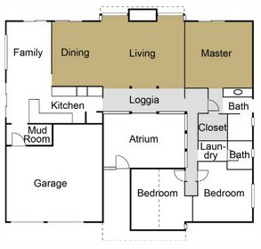
 This is our kitchen. These photos were taken by the previous owner before we bought the house and for the most part still looks pretty much the same today. The view from the loggia looks through the kitchen, out the glass wall/slider and into the green space on the side of the house… too bad the huge breakfast bar peninsula add-on blocks it! (Note: see previous post on lattice removal!)
This pic was taken from the opening of the office nook. You’ll notice that there is something of a pass-thru over the cooktop into the dining room. That opening will be enlarged and those over-cooktop-cabinets will be removed. The microwave lives in a hole above the oven.
To the left (where the plant shelf is) was originally a doorway from the family room into the dining room. It was closed off for some reason. Since this photo we have opened it up again and plan on keeping it that way. The Italian tile will be replaced with VCT as in the loggia (maybe with a color added… maybe not).
This picture of the family was taken from the same spot as the above pic. (Note the hanging plant shelf that is now the location of a re-opened doorway into the dining room.) No that’s NOT our big-honking TV. We’ll be hanging a flat screen on the wall above where that couch is. Since most of the other living areas are predominantly Danish or at least warmer, I think we’ll try to make this space have a more modern look with with some steel, some brighter colors, a FLOR floor covering… y’know, sleeker. The beams will be re-painted Oxford Brown (of course) and I think something needs to happen with that unsupported beam intersection, it just looks weird to me. Those two elCheapo light fixtures will be replaced with ball lights similar to what’s in the hallway. The breakfast bar/peninsula will go away as well, restoring the feel of the original galley style kitchen and making room for our Burke breakfast table & chairs.
Here’s a better view of the peninsula and the sink area. See how the sink and shelf above it are not centered in relationship to each other and in relationship to the overhead beam? This drives Haley bonkers. Those funky fluorescent lights will be replaced with more ball lights. This is the wall that we are hoping will be most inspired by the kitchen in Case Study House #23… but as you’ll note, we don’t exactly have a breathtaking view of the LA Basin. Hmmmm…. (in fact, the garage is on the other side of that wall… there will be no window there, only backsplash).
Here’s a close up of the existing cooktop and the pass-thru into the dining room. This will be enlarged… a lot. Also the Thermador cooktop we picked up on Craigslist will replace the Jen-Air. It’s actually a good cooktop and we’ve enjoyed the BBQ grill feature but it’s white, and it’s gotta go.


