We have lived with temporary countertops for way too long! White quartz was always our choice for the countertops, but we couldn’t decide on the backsplash tile. So… we waited… and waited!
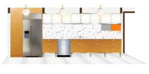
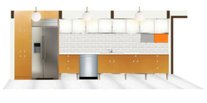
Originally we though we would want a 2×2 ceramic tile. Mostly white with a splash of color randomly placed throughout.
 |
| Original Kitchen Concept |
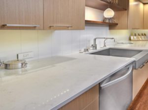
After years of research and living with the kitchen layout, we have narrowed down the tile design to white quartz counters with white subway.
 |
| Inspiration |
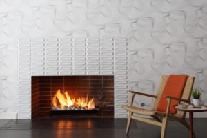
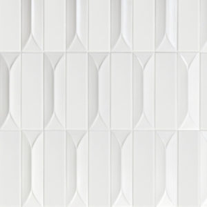
I know!!! How predictable. BUT… we aren’t as boring as it may appear. We do want subway style in a 3×9 inch size. We do want them to be white, or at least a white that matches the quartz countertops. HOWEVER, we have discovered dimensional tiles. Yep. Tiles that have a slight raised geometric pattern in them.
We absolutely LOVE the dimensional tiles created by Heath Ceramic.
 |
| Traditional Subway Tile Layout |
 |
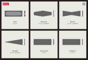
| Heath Ceramics Dimensional Design Options |
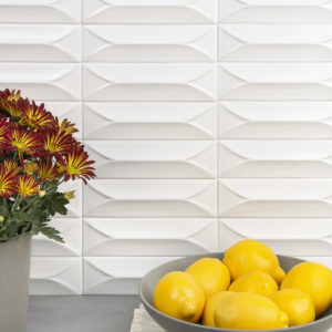
These sleek 3×9 Oval Dimensional tiles are modern and add a sense of interest and texture to a completely white palette. I seriously can’t love these anymore that I already do. HOWEVER, there is one drawback… one very big drawback. These beauties cost $78/sf. That’s right. SEVENTY-EIGHT DOLLARS. Our backsplash area is about 13′ x 2.5’…doing the math, it was clear we needed alternatives.
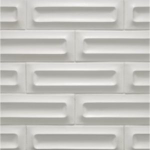
This is a great choice, but I have yet to find out the cost. It may be even more than the Heath Tiles, but I really am digging the classic brick layout. The texture of the dimensional tile really creates an interesting pattern. The product spec sheet outlines other designs and layouts in the line. I will update cost once I visit the showroom. (Today is a snow day… so I’m will trek downtown once we thaw.)
 |
| Classic Brick Layout—Horizontal |
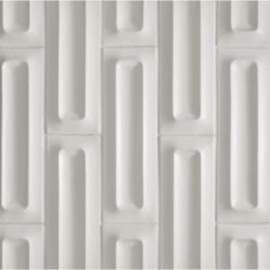
Now, as cool as this layout is, turning it vertical gives it a completely different feel. I really like how the vertical layout breaks up all the horizontal lines and begins to create a completely different look using the same tiles.
 |
| Classic Brick Layout—Vertical |
These are not quite as interesting, but a very viable option. The big plus is that these babies are in stock as our local tile store: Classique Floor & Tile
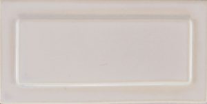
I think this could work in the traditional stacked, horizontal brick, or vertical brick layout. I really need to see these in person, because the white option may not be white enough… it kinda looks grey. Hmmmm.
 |
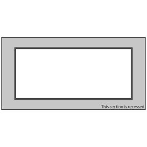
| Frame A 4 x 8 by Pratt & Larson |
The frame is recess so the middle section is relief. My main concern after the color, is the thought a wall of these tiles may look like Legos®. NOT what I’m going for… So let’s keep looking.
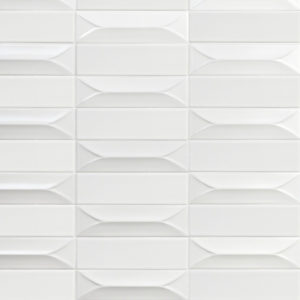
These tiles are interesting. They run about $21.50/sf… which is less than 1/3 the cost of the Heath Oval tiles. Not the same, but point us in the right direction.
 |
| Traditional Stacked—Byzantine Bianco 3D Subway Tile |
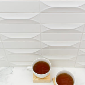
By simply adding a flat 3×9 tile ($16.95/sf) into the layout, the design starts to create a fantastic pattern. Now… we’re getting somewhere. This is AMAZING and I will order a sample to see if this is a good color match to the quartz counters we have selected. WOW. WOW. WOW… just ordered the sample!
 |
| This may be the winner! |
Once I have the samples in front of me, I will have a better idea which way we will go with the backsplash. I am really liking both vertical and horizontal layouts. The mock concepts give me an idea, but I will need to hold these in place to get the best feel for the space.
Decisions. Decisions.
BUT… yeah… those Oval Dimensional tiles from Heath Ceramic…
Oh. My. Heart! 💙
-Haley
